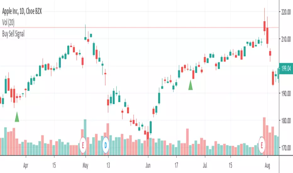
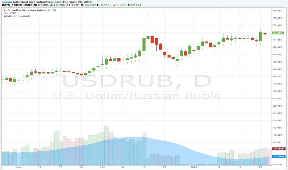
Buy Sell SignalFinding the highest winning percentage trade.
Work best on stock (1D time frame).
Only be available for a month.
If you like it, please message me
Cerca negli script per "Buy sell"
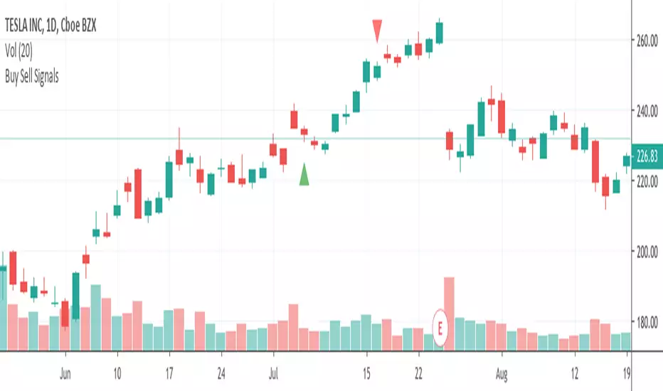
Buy Sell Signals 1Finding the high winning percentage trade signals.
It will be public for a month.
If you like it, please message me

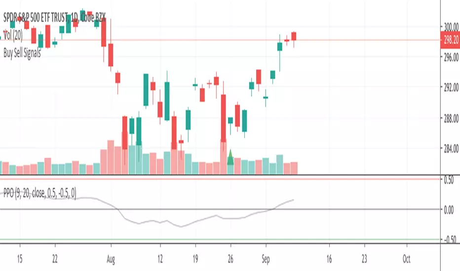
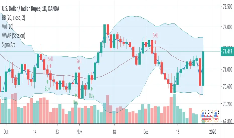
Buy Sell SignalsFinding the high winning percentage trade signals.
It will be public for a month.
If you like it, please message me
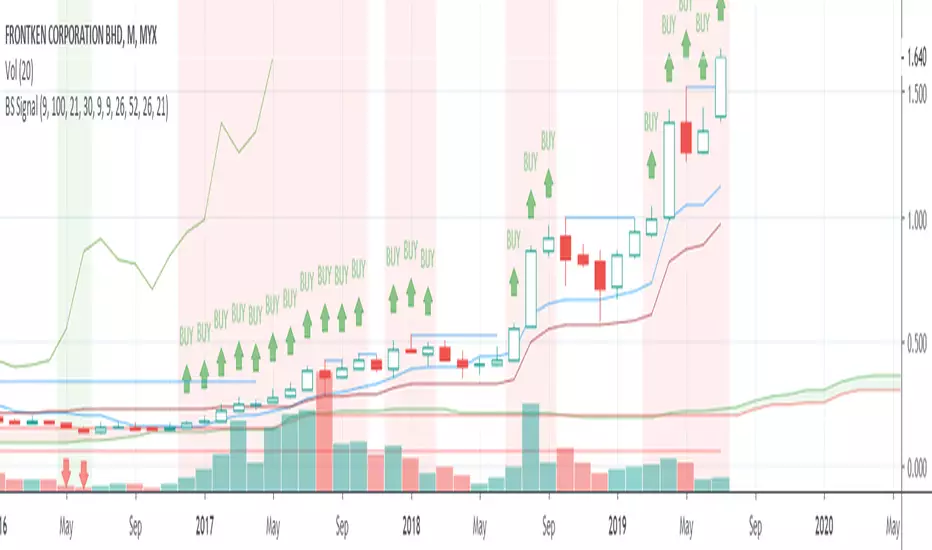
Buy Sell SignalsFinding the high winning percentage trade signals.
It will be public for a month.
If you like it, please message me
Buy Sell SignalsFinding the high winning percentage trade signals.
It will be public for a month.
If you like it, please message me

Buy Sell Signal & IchimokuThe script totally based on technical analysis. Indication of "Buy" will appear once the conditions are matched. Please don't follow "Buy" indication if it appear at top of chart.
Yellow candle is a pre-alert for any momentum coming together with increasing of price.
Yellow circle at volume bar is to show that the momentum was there.
Orange line is support & resistance.

Buy SellKıvanc hocanın yazdığı 2 stop loss indikatörünün birleşmesi sonucu bulundu. Çalışma mantığını kullandıkça anlayacaksınızıdır.


Buy Sell signal by Spicytrader
Get on board before going to the moon !
Spicytrader instantly identifies when a potential pump or dump is beginning.
Compatible with Autoview bot
GET ACCESS : spicytrader.com


Buy/Sell Ahmed Rashiedtrade with confidence good for both intra day and long term took me 2 yrs to finish it


DR.SS.SMART BUY/SMARTSELL SCALPER1️⃣ BEST TIMEFRAME
Use this as a scalper / intraday trend tool
✅ Best
5 min
15 min
⚠️ Avoid
1 min (too noisy)
Daily (signals become late)
2️⃣ FIRST CHECK – MARKET CONDITION (Dashboard)
Before taking any trade, look at the Smart Panel (Dashboard):
✔ Trade ONLY when:
Market State = Trending
Volatility = Active
Trend Pressure = Bullish or Bearish
At least 3–4 MTF boxes are same color
❌ Avoid trades when:
Market State = No trend / Ranging
Purple candles (ADX sideways)
Remember:
T-V-T rule → Trend + Volatility + Timeframe agree
3️⃣ BUY SETUP (LONG TRADE)
✅ Conditions in your code:
Price crosses ABOVE Supertrend
Close ≥ SMA 13
Bar color turns BLUE
Price above EMA 200 → Smart Buy
ADX not sideways (no purple bars)
📍 Chart shows label:
“Buy” → normal buy
“Smart Buy” → high-probability trade (BEST)
🔵 HOW TO ENTER BUY
Enter at candle CLOSE where Buy / Smart Buy appears
Do NOT enter mid-candle
🛑 STOP LOSS (Auto from code)
SL = ATR-based stop
Shown as red SL line
👉 Safe rule:
Never widen SL
🎯 TARGETS (Auto plotted)
TP1 = 1:1
TP2 = 2:1
TP3 = 3:1
📌 Recommended management:
Book 50% at TP1
Move SL to Entry
Hold rest till TP2 / Trail
4️⃣ SELL SETUP (SHORT TRADE)
✅ Conditions:
Price crosses BELOW Supertrend
Close ≤ SMA 13
Bar color turns RED
Price below EMA 200 → Smart Sell
No sideways (ADX > 15)
📍 Label shown:
“Sell”
“Smart Sell” (BEST)
🔴 HOW TO ENTER SELL
Enter at close of signal candle
Follow same SL & TP rules
5️⃣ SUPPLY & DEMAND CONFIRMATION (POWER FILTER)
🔹 Best Buy:
Price near Demand Zone
Then Smart Buy appears
🔹 Best Sell:
Price near Supply Zone
Then Smart Sell appears
👉 These are institutional entries
6️⃣ WHEN NOT TO TRADE ❌
Avoid trades when:
Purple candles (Sideways)
Supertrend flipping repeatedly
MTF dashboard mixed colors
During low-volume sessions
7️⃣ SESSION WISE BEST PERFORMANCE
From your session logic:
✅ Best Scalping:
London
London + New York overlap
⚠️ Avoid:
Mid-Tokyo (low volatility)
8️⃣ PERFECT TRADE CHECKLIST (SAVE THIS)
Before clicking BUY/SELL, ask:
✔ Smart Buy / Smart Sell?
✔ Price above/below EMA 200?
✔ Dashboard trend agrees?
✔ No sideways candles?
✔ Volatility Active?
👉 If 4 out of 5 = YES → TAKE TRADE
9️⃣ SIMPLE ONE-LINE STRATEGY
Trade only Smart Buy/Sell in trending market, book partial at 1:1, trail rest with Smart Trail
✅ BEST TRADING SESSIONS (Use ONLY these)
🥇 LONDON SESSION (BEST & SAFE)
🕒 12:30 PM – 4:30 PM IST
Why best for your script
Clean trends
Good volatility
Less fake signals
Supertrend + EMA200 works perfectly
👉 This should be your PRIMARY session
🥈 LONDON → NEW YORK OVERLAP (MOST POWERFUL)
🕒 6:00 PM – 8:30 PM IST
Why
Institutional money enters
Strong breakouts
Smart Buy / Smart Sell accuracy highest
👉 Use only Smart signals in this session
🥉 NEW YORK SESSION (Early Part Only)
🕒 6:00 PM – 9:00 PM IST
Use when
Market State = Trending
Volatility = Active
MTF mostly same color
⚠️ Stop after 9:00 PM IST
❌ SESSIONS TO AVOID
🚫 TOKYO SESSION
🕒 5:30 AM – 10:30 AM IST
Low volatility
Sideways (purple candles)
Many fake reversals
🚫 SYDNEY SESSION
🕒 2:30 AM – 5:30 AM IST
Very low volume
Not suitable for scalping
🚫 INDIAN MIDDAY
🕒 11:00 AM – 12:15 PM IST
Choppy
Stop-hunting candles
📌 BEST DAILY ROUTINE (Follow This)
Time (IST) Action
9:15 – 10:30 ❌ Avoid (fake moves)
12:30 – 4:30 ✅ TRADE (Best zone)
6:00 – 8:30 ✅ TRADE (High accuracy)
After 9:00 ❌ Avoid
🧠 EASY MEMORY RULE (Your Style)
“LON → NY = MONEY” 💰
“ASIA = NO TRADE” ❌
🎯 FINAL RECOMMENDATION
If you want only ONE session:
👉 Trade ONLY: 12:30 PM – 4:30 PM IST
This will give:
Less stress
Higher win-rate
Cleaner Smart Buy/Sell signals
🇮🇳 BEST TRADING SESSIONS (INDIA – IST)
🥇 LONDON SESSION – BEST FOR INDIAN TRADERS
🕒 12:30 PM – 4:30 PM IST
✅ THIS IS THE BEST SESSION
Strong trend moves
High accuracy Smart Buy / Smart Sell
Less sideways (purple candles reduce)
Works perfectly with Supertrend + EMA 200
👉 Use this as your MAIN session
🥈 LONDON → NEW YORK OVERLAP (POWER SESSION)
🕒 6:00 PM – 8:30 PM IST
✅ Very strong moves
Institutional activity
Best breakouts
High RR trades (2:1 / 3:1)
⚠️ Trade only Smart Buy / Smart Sell
⚠️ Avoid over-trading
🥉 INDIAN MARKET OPEN (LIMITED USE)
🕒 9:20 AM – 10:15 AM IST
✔ Use only if:
Dashboard = Trending
Volatility = Active
Direction same as higher TF
❌ Avoid after 10:30 AM
❌ SESSIONS TO AVOID (INDIA)
Session Time (IST) Reason
Tokyo 5:30 – 10:30 AM Sideways / fake moves
Mid-day Chop 11:00 – 12:15 PM Low volume
Late NY After 9:00 PM Whipsaws
📌 BEST DAILY ROUTINE (INDIA)
Time What to Do
9:15 – 9:20 ❌ No trade
9:20 – 10:15 ⚠️ Only clean Smart signals
12:30 – 4:30 ✅ MAIN TRADING WINDOW
6:00 – 8:30 ✅ HIGH PROBABILITY
After 9:00 ❌ Stop trading
🧠 EASY MEMORY RULE
“INDIA → LONDON → MONEY” 💰
“ASIA MIDDAY → NO TRADE” ❌
🎯 FINAL ANSWER (ONE-LINE)
👉 For India (IST), trade ONLY between
12:30 PM – 4:30 PM and 6:00 PM – 8:30 PM

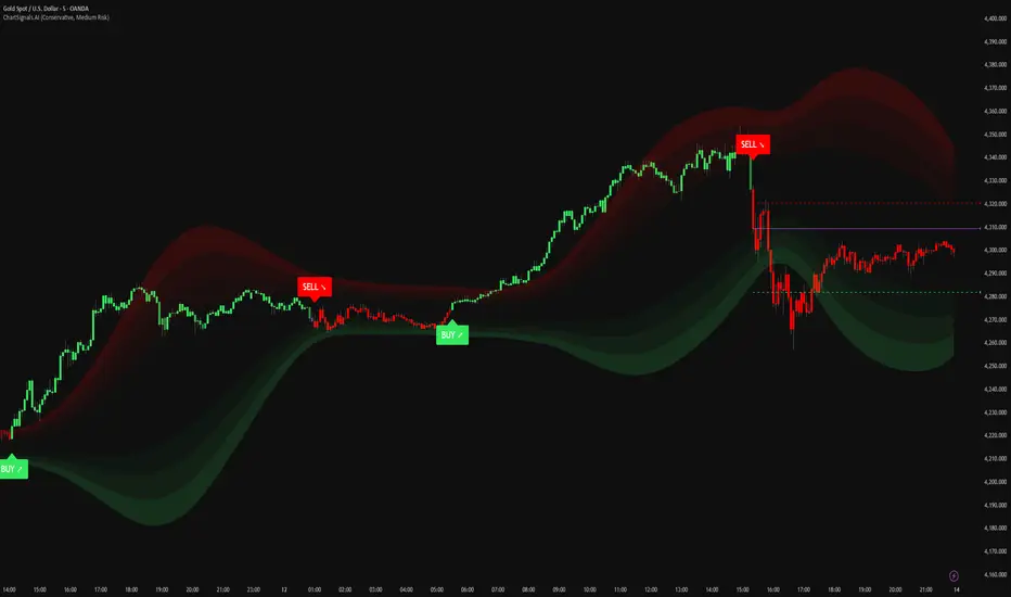
ChartSignals.AIChartSignals.AI is an overlay indicator designed to simplify chart reading by highlighting potential trade opportunities and providing optional visual context tools.
WHAT YOU’LL SEE
• Buy/Sell signals displayed directly on the chart
• Optional trade level guides (Entry / Take Profit / Stop Loss) to help structure a plan
• Optional trend and zone overlays to help interpret market conditions
• Optional key levels and breakout markers for additional context
• Dynamic candle coloring to help visualize momentum vs. quieter conditions
HOW TO USE (SIMPLE)
• Add ChartSignals.AI to your chart
• Choose a Signal Mode (controls how frequently signals appear)
• Enable/disable the optional overlays you want
• Use signals as chart assistance and confirm with your own analysis and risk management
ALERTS
This script includes alert conditions for:
• Buy, Sell, general signal notifications, and key level break events (when enabled).
DISCLAIMER
For educational and charting purposes only. Not financial advice. Trading involves risk and you are responsible for your own decisions.
Malama's Range BreakoutMalama's Range Breakout is a dynamic Pine Script v6 indicator designed to automatically detect periods of price consolidation (tight ranges) on any timeframe or market, visually highlight them with expandable boxes, and generate actionable signals for breakouts and wick-based reversals.
Key Features
Adaptive Consolidation Detection: Uses a volatility-adjusted threshold (ATR multiplier) over a user-defined lookback period to identify genuinely tight ranges, avoiding false detections in trending or high-volatility conditions.
Preset Profiles: Quickly switch between optimized settings for different trading styles:
Tight Ranges (Scalping): Short lookback, low threshold for frequent small-range setups.
Normal Ranges (Intraday): Balanced for day trading.
Swing Trading: Longer lookback for larger consolidations.
Options Selling (Chop): Very low threshold to capture extended sideways/choppy phases.
Custom: Full manual control.
Visual Elements: Draws semi-transparent boxes around detected ranges (with optional dashed midline), dynamically extending them until a valid breakout occurs. Limits historical boxes for clean charts.
Breakout Signals: Triggers buy/sell labels and alerts only on confirmed breakouts, optionally requiring a volume spike (above SMA threshold) for higher-probability momentum moves.
Wick Reversal Signals: Detects rejection wicks touching range boundaries (without closing outside), signaling potential fakeouts or early reversals. Optional next-bar confirmation (e.g., bearish candle after upper wick) reduces false signals.
Built-in Alerts: Separate alert conditions for range detection, bullish/bearish breakouts, and confirmed/unconfirmed wick reversals.
How It Works
The script continuously monitors the price range over the selected lookback period. When the range contracts below the ATR-based threshold, it initiates a consolidation box starting from the tightest point. The box expands with new highs/lows while price remains inside.
A true breakout closes outside the box (with optional volume confirmation) → ends the range and plots a directional signal.
Wicks probing boundaries without closing outside → flags potential rejection/reversal zones inside the range.
This combination helps traders anticipate volatility expansion after compression, while distinguishing strong momentum breakouts from traps/false breaks.
Why It's Useful
Unlike fixed-time Opening Range Breakout (ORB) tools or simple consolidation detectors, this indicator adapts to current market volatility (via ATR) and works across all timeframes—ideal for scalping tight intraday ranges, capturing swing consolidations, or identifying chop for premium-selling strategies. The volume filter and wick reversal detection add confluence, helping avoid low-conviction trades in ranging markets.
Usage Tips
Best on liquid assets (stocks, futures, forex, crypto).
Combine breakouts with trend filters (e.g., higher-timeframe EMA) for directional bias.
Use wick signals cautiously in strong trends—they shine in ranges or at key levels.
Test presets on your preferred timeframe; "Normal" is a solid default for most intraday work.
No repainting: All logic based on confirmed closes.
